Pavilion
When I worked at Bear, Pavilion was a client. They were a very high-end, luxury office brand that took pleasure in providing a level of care and exceptional settings that allowed their members' businesses to flourish. and they desired for that to be optimised while maintaining their visual identity. My main contribution to the project was designing the logo and type assets, which are crucial for achieving that high-end look and feel. The choice of imagery and colour grades is also important.

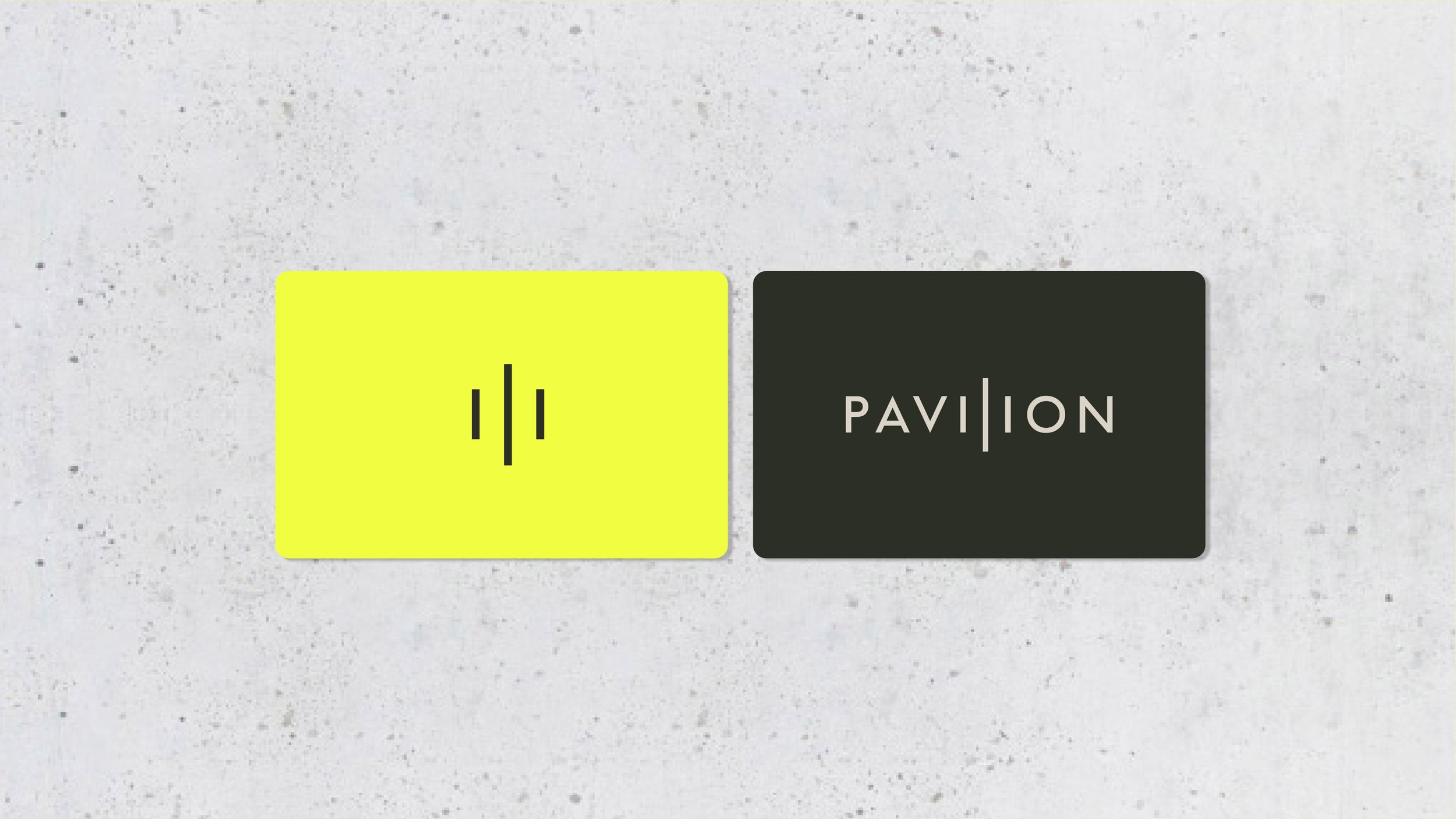

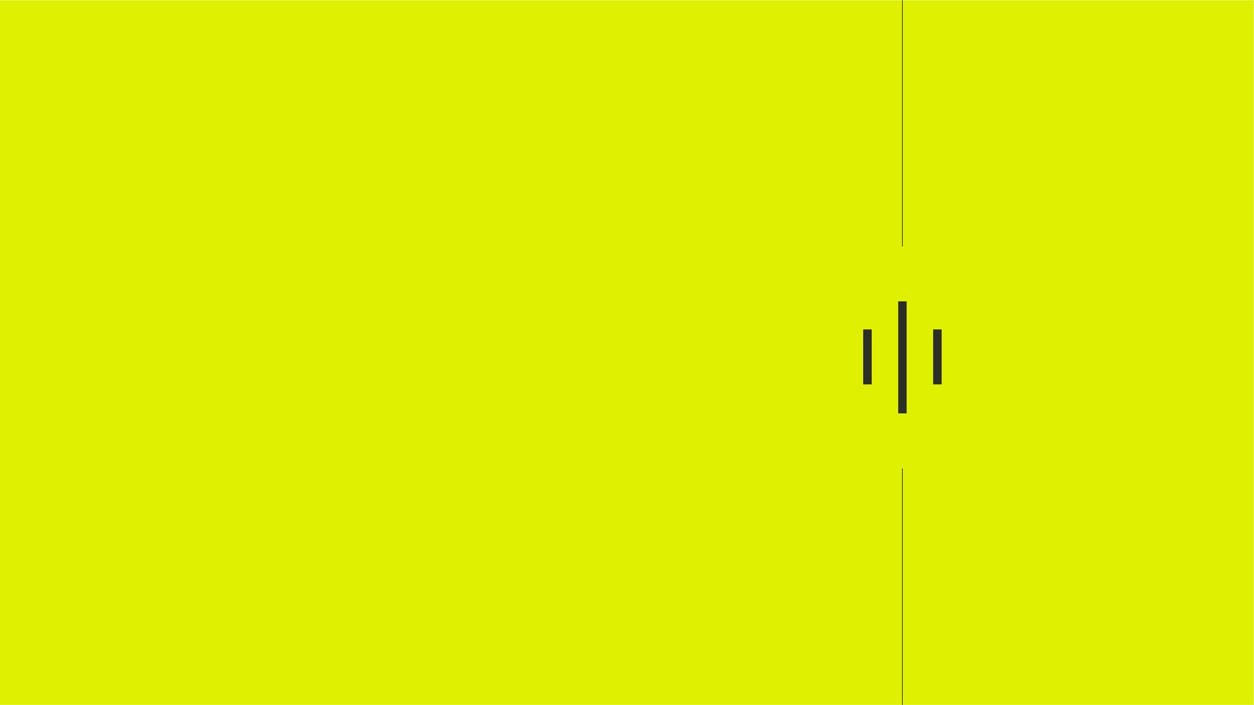
The Pillar device is located in the middle of the PAVILION word mark. An illustration of our argument and a subtle allusion to architecture. It can be utilised as a visual shorthand for the brand when and where it is suitable because it is a mark of quality.